Just for fun.

Just for fun.
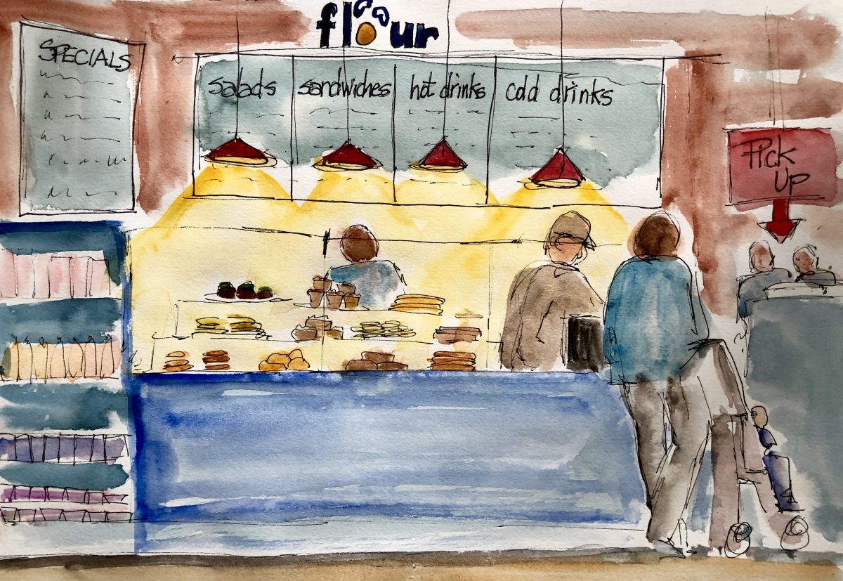
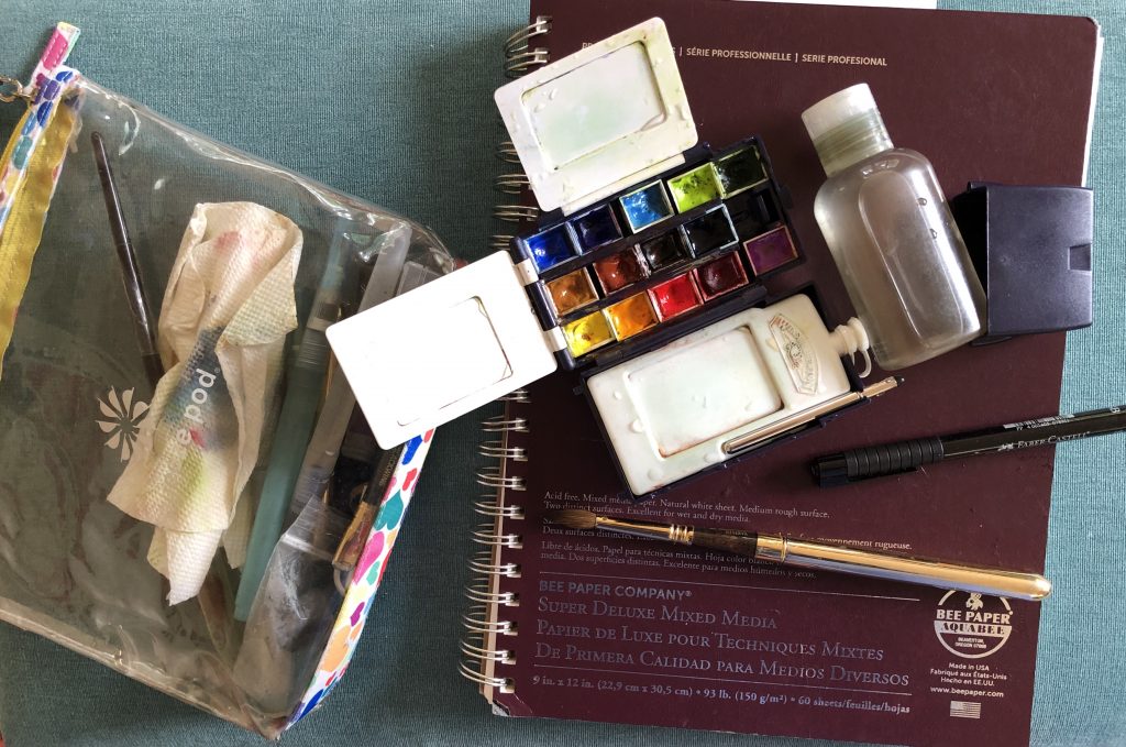
Sketching on location rarely produces great art, but it’s a fun way to be in the moment and really tune into your surroundings. I have a small sketching kit so I can “grab and go.” I love cafes like L’Aroma in West Newton. Last week I visited a wonderful cafe/bakery called Flour and spent a lovely hour munching and sketching.

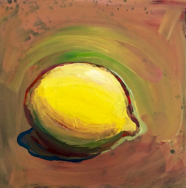
Painting a single object like a lemon is not as easy as it looks. Getting the highlight when the sun hits, and the curve, and the shadow side take practice. Luckily, with acrylics, you can make mistakes and change things. I like the background, which looks like copper, but is actually the product of several different colors on top of each other. The whole little painting, actually, is on top of another painting that didn’t work.
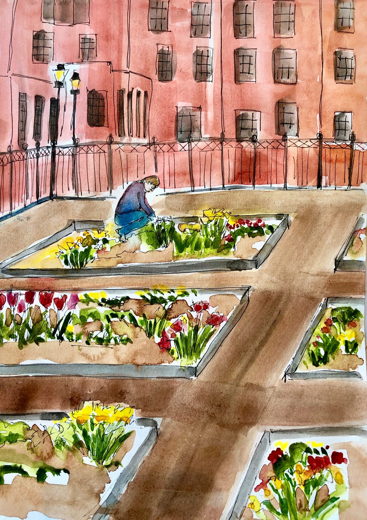
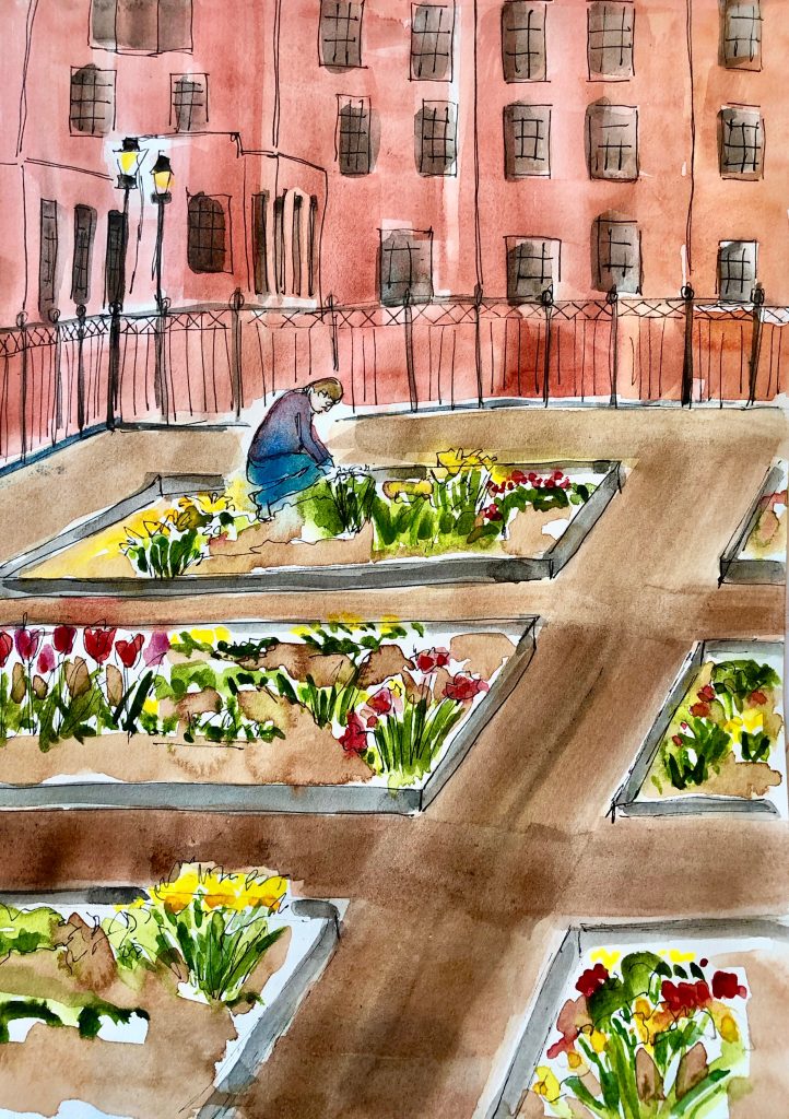
In the South End of Boston last week, I saw this half block community garden in the midst of an expensive gentrified neighborhood. There was a sign on the gate telling how neighbors could sign up for a plot. I took a quick photo on my phone, went into a coffee shop and sketched it.
People say to me, “Isn’t watercolor the hardest medium? Acrylics and oil are so much more forgiving.“ My response was always that for me watercolor was like being an only child. It’s all I’ve ever known, and so I it feels normal to me. But as I’m learning to paint with acrylics, I’m starting to see what people mean. It’s crazy how with acrylics you can change things over and over. This little painting went through many stages.
![]()
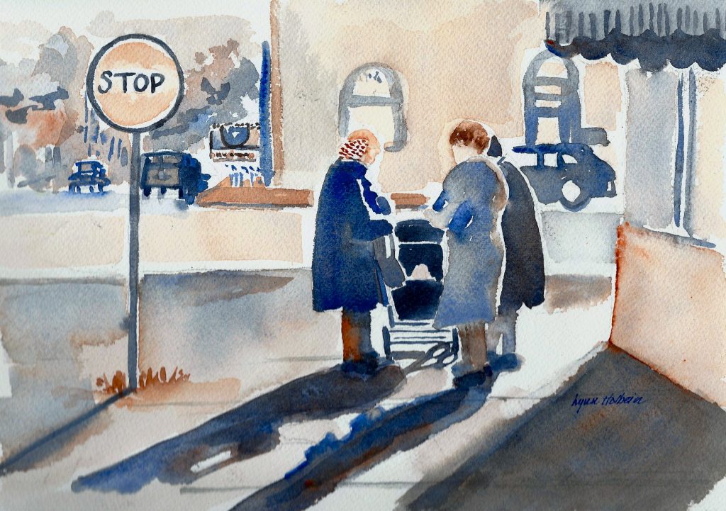
A black and white postcard with this photo caught my eye. I loved it, so I translated it into paint, using just two colors, French ultramarine blue and burnt sienna. Together they make varied shades of gray and beige.
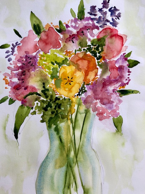
Spring, belatedly, has arrived in New England. On Tuesday, my friend Betsy invited a couple of us over to paint. This bouquet of flowers were picked fresh from her garden.
Matted original 11″ x 14″ available for $95.
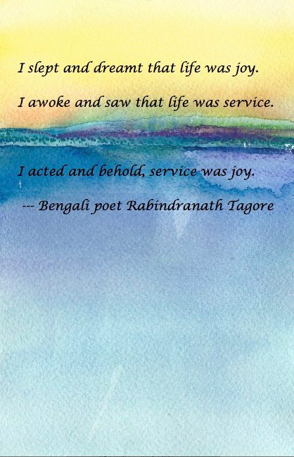
A friend of mine once replied, when asked to do something, “What’s in it for me?” I didn’t know what to say, but this poem is the answer.
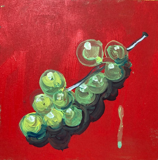
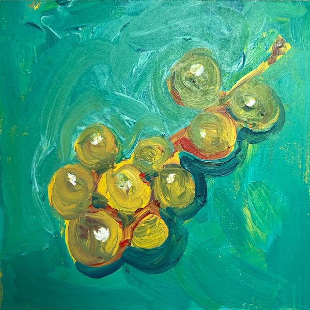
These Muscat grapes are a delicate pale color. It’s so much easier with acrylics to paint a dramatic background, so I tried it here with red and green. Red is the opposite for green, which makes it more exciting; a similar background, green on green, is more restful. I prefer the red; which one do you like better? The drip was an accident, but I like it.