There are beautiful water lilies on a pond near our house. The flowers open in the morning and close in the evening.
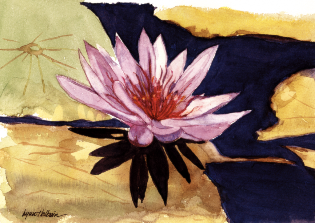
There are beautiful water lilies on a pond near our house. The flowers open in the morning and close in the evening.
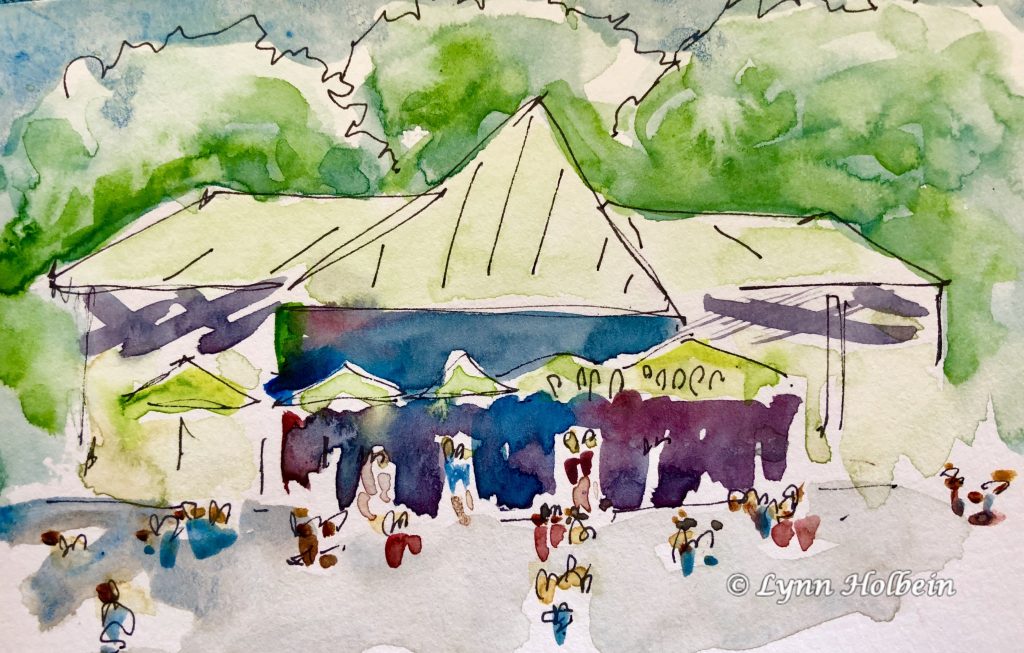
Isn’t it fun how a series of casual dots and dashes can suggest a lively populated scene? This sketch was painted on a hot August day, sitting on the grass watching kids splashing in the wading pond on the Boston Common. (The pond becomes a skating rink in the winter.) This took about 15 minutes; sometimes when you’re not trying hard, it’s easier to catch “the magic.”
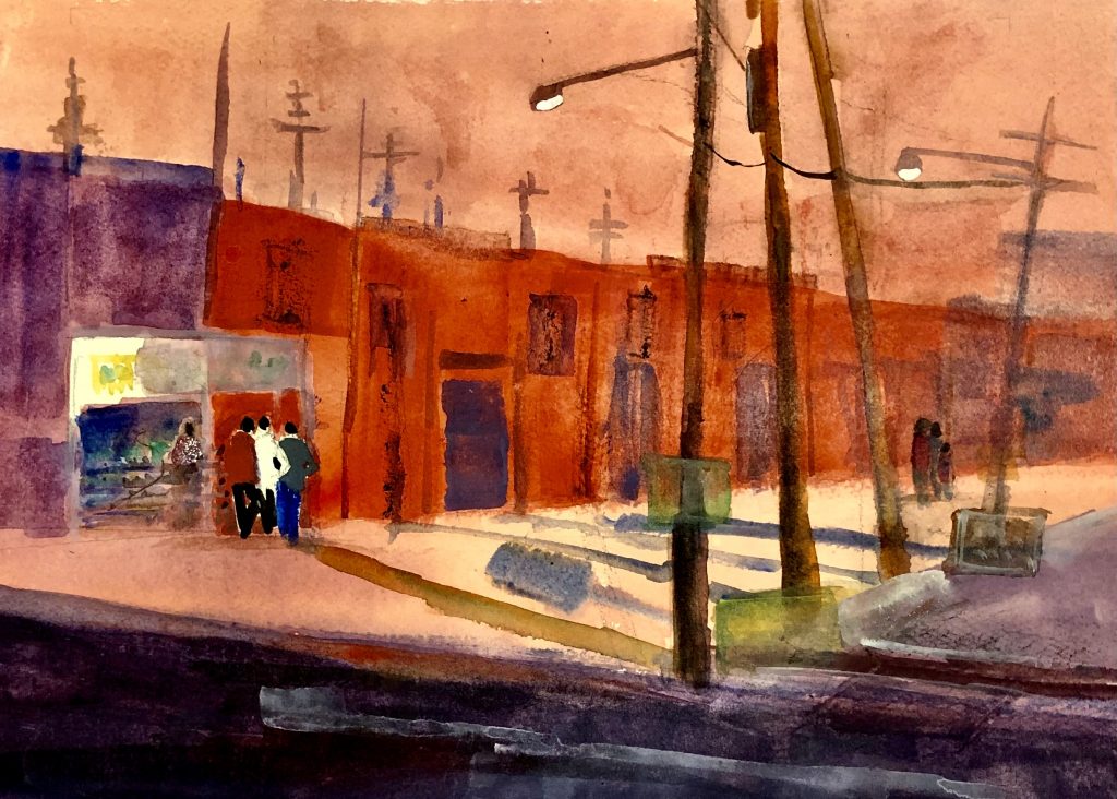
My painting was inspired by memories of the colorful buildings in Mexico, and a beautiful painting by Robert Noreixa. Why do North Americans paint our houses such drab colors? In Central America, you’ll find pink, blue and green houses next to each other. I like the diminishing perspective of the buildings and telephone poles and and the loose shapes that portray figures.
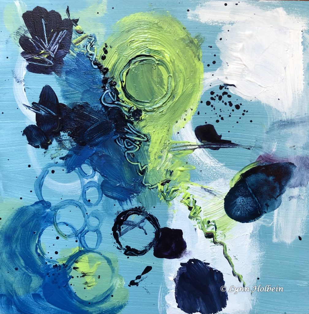
First, thanks to the many people who wrote last week with their opinions about abstract vs. representational art. A plurality like something they can recognize in a painting; many appreciate pure color and shape, and many others like both. Thanks to those who said they are enjoying the experimentation of my personal art journey.
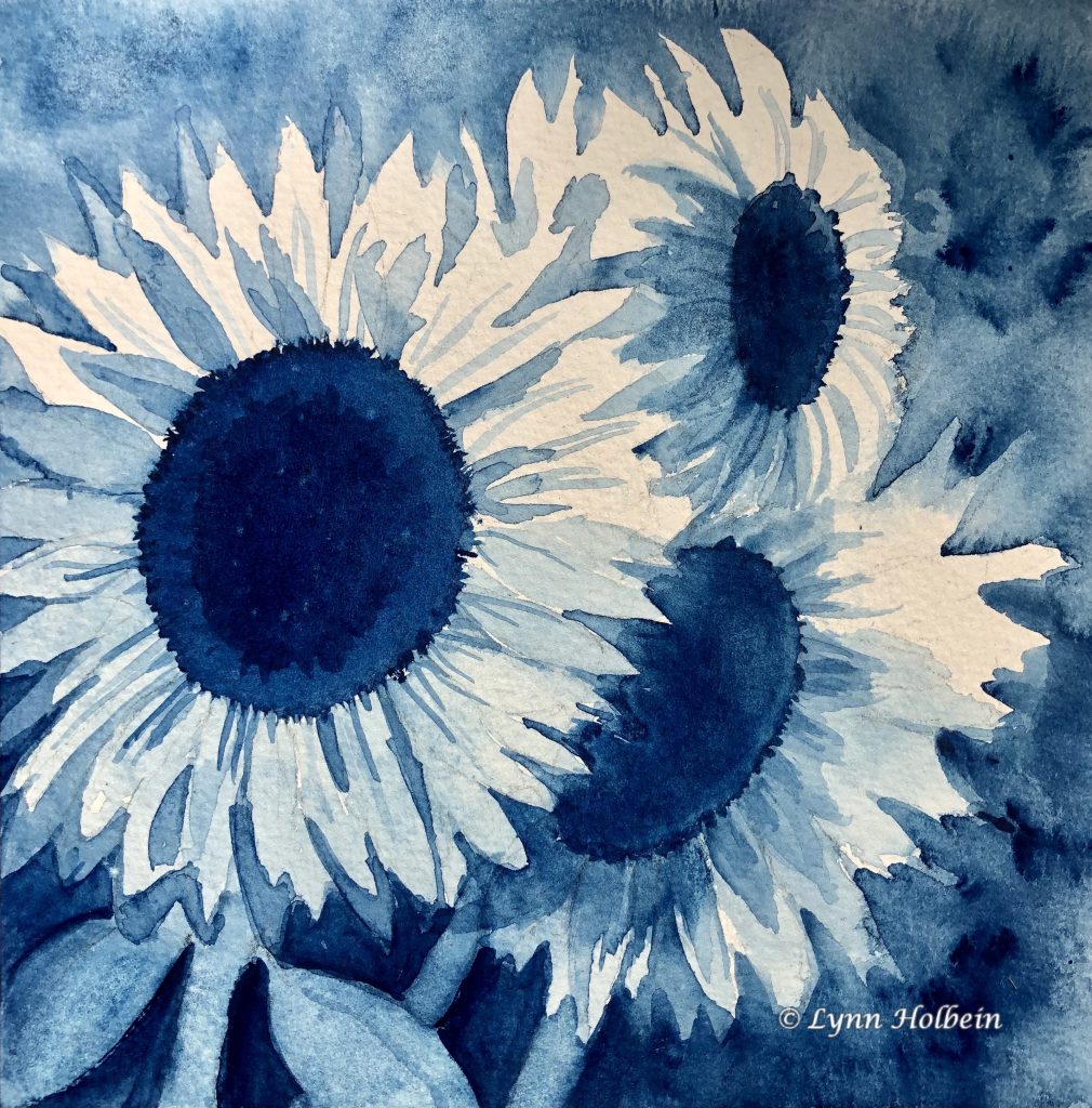
“Values” is the art term for the darks and lights of a painting, and it is said that the value pattern is more important than color. The challenge of this exercise (for a new class I’m taking) was to make an entire painting with a single color, diluted with more or less water.
Having never done any art in my life, I took my first watercolor class at age 49 and was hooked. Since them I’ve been mostly a representational artist. But the colors and shapes of abstracts are starting to appeal to me. Do abstracts appeal to you, or do you prefer paintings of things you can identify? I’d be interested in your opinion.