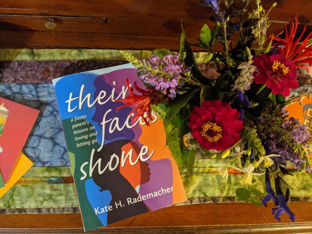
As some of you know, our daughter Kate published her second book this summer, Their Faces Shone: A Foster Parent’s Lessons on Loving and Letting Go, about her family’s experience fostering a two-year-old girl. In the book, Kate explores the question of where family begins and ends, and how things change when we invite strangers–with complicated stories and baggage–into our lives. Kate is currently giving away ten signed copies of the book! You can find out more about the book and the giveaway here.
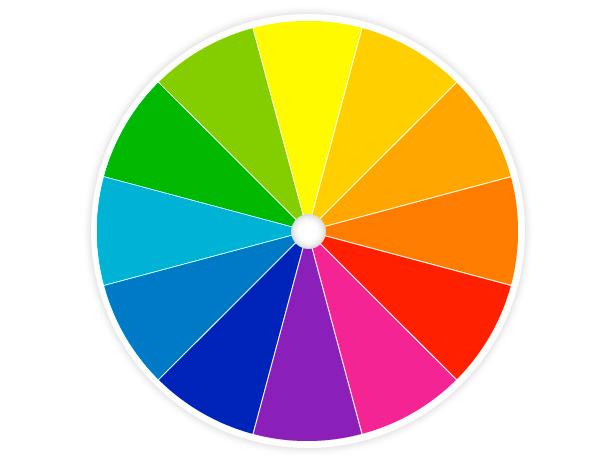
PS – I love the colors in the book cover – don’t you? A good example of making it “pop” by using opposites on the color wheel, in this case the cool colors (blue/green/purple) opposite warm orange.