As every advertiser, decorator and designer knows, we have emotional responses to colors.
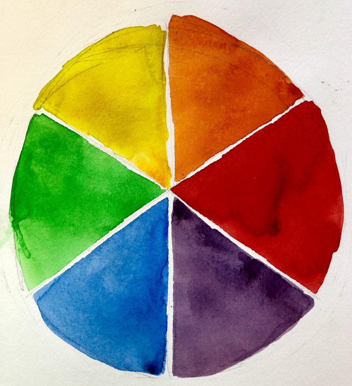
If you are interested, here are the basics. The color wheel is made up of three primary colors — red, yellow and blue — and three secondary colors — orange (red + yellow), purple (red + blue) and green (blue + yellow). Yellow, red and orange are the “warm colors,” reminding us of fire. Blue (ice), green and purple are the “cool colors.”
Using contiguous colors together (green trees + blue lake and sky) produces a peaceful feeling. Combining opposite colors (blue/orange, red/green, yellow/purple) creates a vibration of excitement. A woman in an extroverted mood might accent her green blouse with a red scarf. When she was feeling quieter, she might dress in neutrals (gray, black, brown) or contiguous colors.
The last two paintings which I posted, “Clementines” and “View of New York City,” used the blue/orange combination to produce interest.

